client
sonos
text
short long
design language
Establishing a design foundation for the future of Sonos.
Building a bold new identity for future Sonos products.
We partnered with Sonos to define the next generation of product and packaging design. Through research and workshops, we developed a new visual language that now shapes the Sonos product ecosystem.
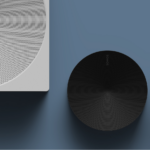
Sonos is known for delivering rich, immersive sound experiences at home. We worked closely with their team to develop a new industrial design and packaging direction that would guide the next era of Sonos products.
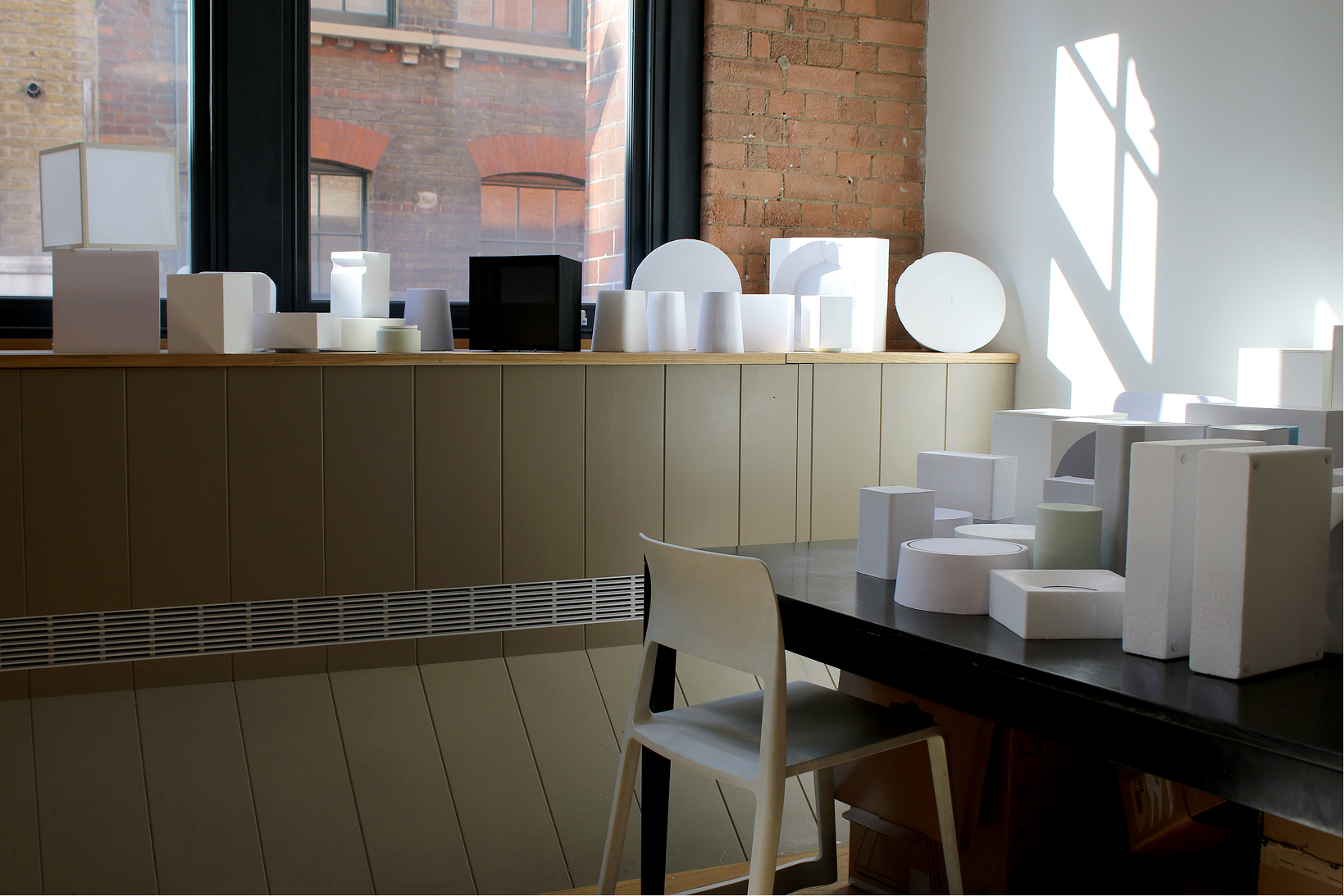
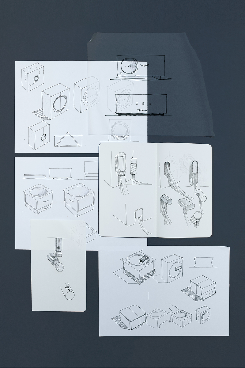
Over six months, we explored how emerging behaviours, including voice control, portability, and 360° sound, should influence the physical design of audio hardware. Together with Sonos, we reimagined core products and proposed new design archetypes through a series of collaborative workshops.
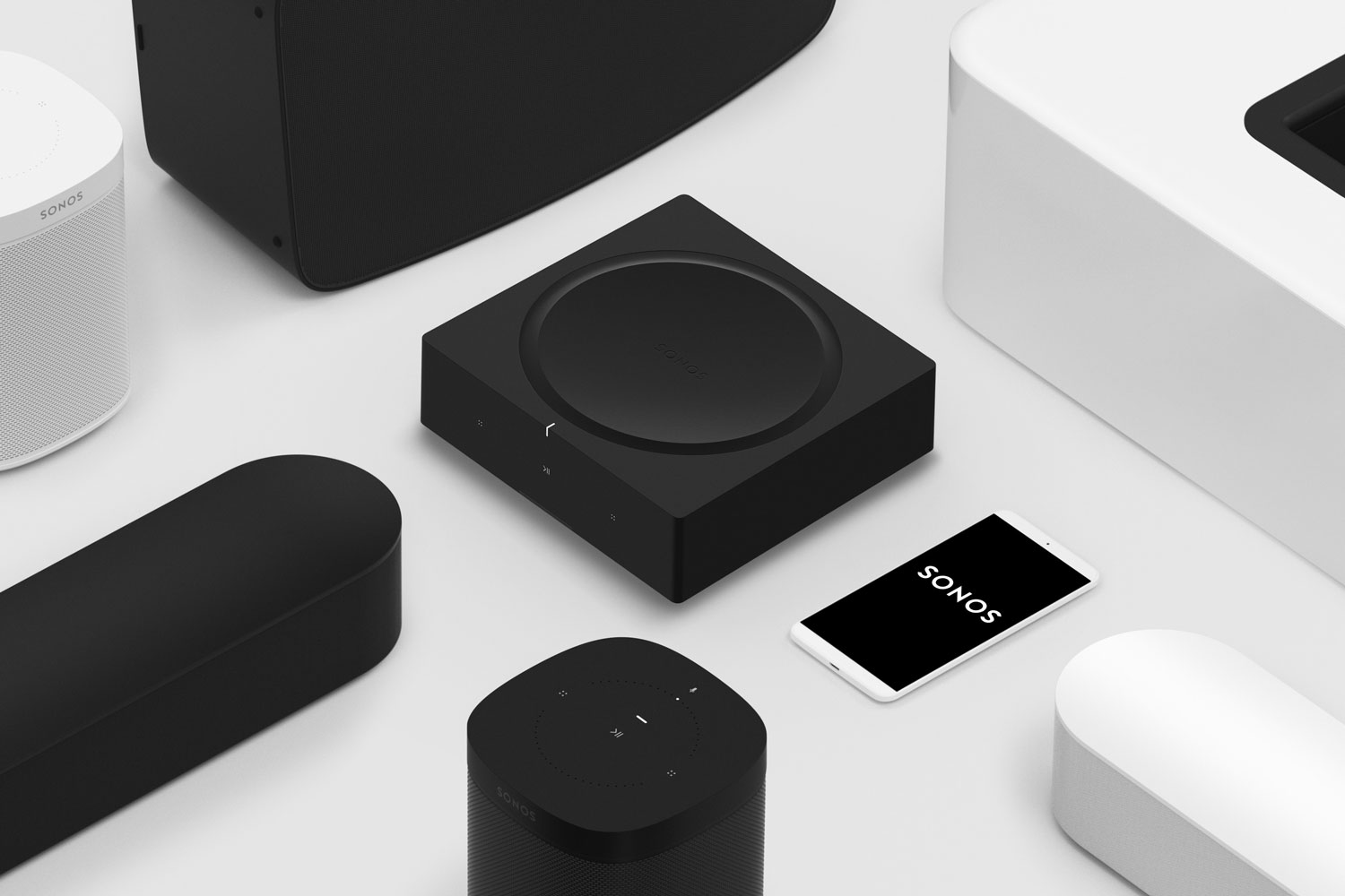
At the heart of this approach was a shift in form. Each Sonos product was treated as an element within a complete sound system. We evolved their visual language into something more monolithic and graphic, giving each product presence and clarity.
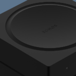
The Sonos signature “squircle” (a blend of circle and square) was reinterpreted. By combining these basic forms in new ways, we created a distinct and recognisable geometry that feels both confident and timeless.
This work laid the groundwork for a new design system that Sonos’s in-house team continues to build upon — starting with the launch of the Sonos Amp.
/